
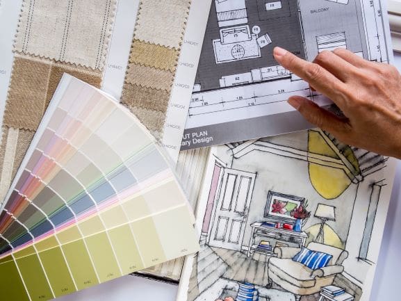
Every year, the color experts at Pantone release their “Color of Year” that inspires design trends for everything from home furnishing and fashion to product packaging and industrial signs for the coming months.
The Color of the Year 2020: Classic Blue evoked feelings of stability and tranquility that we all needed during the year, so the hue for 2021 is highly anticipated. Although Pantone is keeping its annual color under wraps, here are our predictions for what it could be:
Rich earth-tone
Many paint experts have already released their color predictions for the new year. Better Homes & Gardens compiled colors of the year from Farrow & Ball, HGTV Home by Sherwin-Williams and Valspar, and they all include muted hues inspired by nature. From warm tans, rich coppers and lush greens, it wouldn’t be surprising to see this trend in Pantone’s Color of the Year.
These earth-tones create feelings of both calm and luxury, the best of both worlds for homeowners looking to capture this aesthetic in their home décor.
Minimalistic metal
While most of the colors Better Homes & Gardens highlights are very similar in tone and aesthetic, one stands out: Sherwin-Williams’ color of the year Urbane Bronze. This dark brown with warm undertones is the perfect complement to natural textiles like wood, leather and metal. As a “minimalist expression of nature” it is a welcoming color that works best with a touch of shine from a polished silver or brass accent from a bed frame, mirror or artwork.
Pale apricot
Another standout color to keep an eye out for is apricot, and not the bright orange you may be thinking of. Rather, a pale apricot that resembles more of a light terracotta is making it to multiple color collections for the new year. My Move explained that orange hues have been popular of late as many homeowners are using them as pops of color in home décor and for accent walls. However, the more subdued apricot can easily be incorporated into a room or be used to paint an entire space.
It’s blush tones are romantic, warm and a nice refresh from some of the darker shades we previously mentioned.
Neutral grays
There’s something to be said about gray. It’s an amazing base for any room in the house and easily complements most decor and other colors. In a complicated year, a clean gray could be just what we need. Like with the other colors we identified, it will likely be in a more natural or metallic hue.
So, which will it be?
Pantone chooses its Color of the Year through a unique process that includes analyzing current trends in art, fashion, design and even technology. So while we won’t know the color for 2021 just yet, there’s a good chance that it will be inspired by nature, whether that means a muted earth-tone, dark metallic or soft apricot.
Keep an eye out for Pantone’s announcement to see if we were right and contact us today to learn more about incorporating the Pantone Color of the Year in your home design alongside your Phantom screens.